On this page:
Guidelines
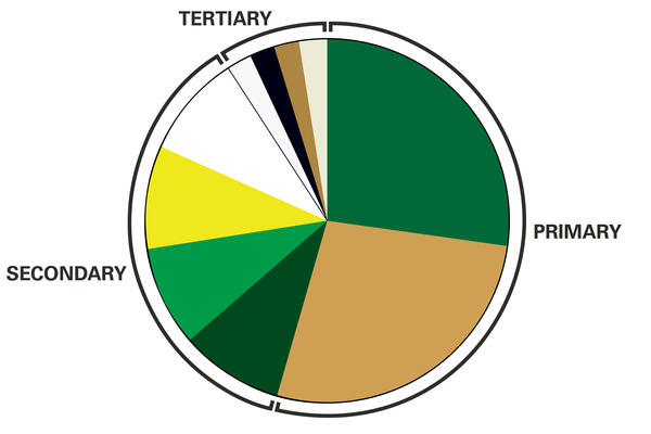
Our color palette is divided into three groups: primary, secondary, and tertiary.
Our primary palette should always lead, while the secondary and tertiary palettes add depth and support to our communications and marketing.
The primary print color palette is the official Wright State green and gold and should be used prominently and dominantly. White can be used as an auxiliary color when needed (such as the biplane logo appearing in white on a dark background).
The secondary and tertiary palettes are to be used only to support and complement the primary color palette. They were designed to work with the Wright State green and gold, and should only be used to provide visual interest. This ensures a more consistent use of color across all marketing and communications.
The Wright State colors and brand must be recognizable and prominent. Avoid color combinations that could represent other universities and colleges.
Do not build a layout around secondary colors. If the project does not look like it comes from Wright State, it is a violation of the university's brand.
These colors are authorized for use on the web and for other digital media, such as email, Microsoft PowerPoint presentations, video, electronic newsletters, etc.
Embroidery thread color recommendations can be found on Merchandising and Licensing.