Primary Logo and Wordmark

- Primary Logo Downloads
- Primary Wordmark Downloads
- Download Files Naming Convention and File Types
- Guidelines
- Unacceptable Usage
- Logo Phaseout
Primary Logo Downloads
The primary university logo lockup consists of two elements: the biplane graphic and the stacked Wright State University wordmark.
The primary university logo and wordmarks are the official trademarks and primary symbols of Wright State University. They are not permitted to be altered or reproportioned in any way, except as specified in this manual. To maintain art integrity, they must be reproduced from original files.
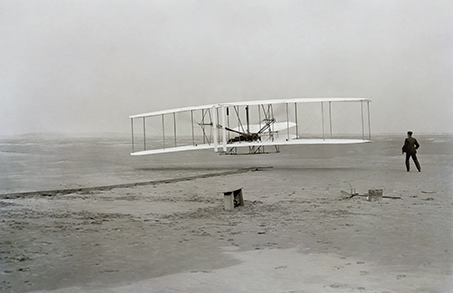
The Wright State primary logo is based on the photograph "First Flight," by John T. Daniels. Wright State University was named to honor aviation pioneers Orville and Wilbur Wright, who invented the world's first successful airplane in their Dayton bicycle shop.
Full Color Primary logo

The full-color logo should be used whenever possible. In certain situations, it is not possible to use this logo, so the following three options are acceptable for use in the specified situations.
Green Primary Logo

Use of the green logo is permitted when color is limited, or in situations where print quality may be unpredictable.
Reverse Primary Logo

The reversed logo is used when logo appears in white on a solid background, such as the green block demonstrated here. The logo can only appear in this format on a solid-color background.
Black Primary Logo

The one-color black logo is used in the case of single-color printing, or if print quality is unpredictable.
Wordmark Downloads
The primary wordmark may be used whenever the primary university logo is not appropriate. Wordmarks appear only in green, reverse, or black. A gold wordmark may appear only on a green field and is available upon request.
The wordmark may be reversed out of a dark portion of a photograph as long as the words are completely legible.
The Wright State wordmark is made up of customized lettering, so do not attempt to typeset these words as a wordmark.
Green One-line Wordmark


Black One-line Wordmark

Green Two-line Wordmark


Black Two-line Wordmark

Limited use Three-line Wordmark
This limited-use wordmark is available primarily for social media applications, but may be used in situations of restricted space with prior approval from the Office of Marketing.


Download Files Naming Convention and File Types
Naming Convention
This is how we name our brand asset files. Each logo will be given a unique number. This consistent naming convention makes it more convenient to find exactly what you need.
Many files are available for download from this website. If a particular mark is discontinued, the mark and its unique identity number will be removed from the downloads page.
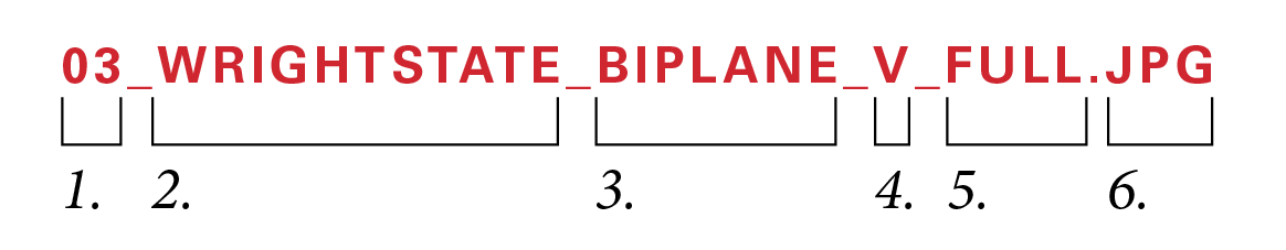
- unique file number
- unit identifier
- branding element identifier
- intended orientation of element (vertical, horizontal)
- color designation—FULL (full color), K (all black), REV (all white), or GRN (all green)
- file extension
File Types
Depending on your intended use, we have provided a variety of file types in the following formats:
.JPG: These files are primarily used in digital applications and with certain software like Microsoft Word or PowerPoint when you are creating your own printed items.
.PNG: These files are used on the web and in certain software like Microsoft Word or PowerPoint. Our files have a transparent background so that the logo can be placed over a texture without being inside a white box.
.EPS: Used primarily for printed materials, including promotional items, these vector files contain Pantone® colors, most commonly used by professional designers. These files may not be compatible with certain software products like Microsoft Word or PowerPoint.
If you need a specific file type that does not appear to be available, contact the Office of Marketing for assistance.
Guidelines
All university marks must be used in accordance with the guidelines outlined in the Brandbook. This includes secondary and tertiary marks, to which these same rules apply.
All Wright State publications with an external audience and funded using university money should be designed and produced through the Office of Marketing and clearly identified as coming from Wright State University.
The primary logo or the primary wordmark must appear prominently on all university publications, communications, and digital media*. In addition, the primary corporate mark should appear on the back of each publication and/or next to the return address of a mail piece. On mailing panels and envelopes, the return address should include the primary corporate mark in full color, unless color is not possible. When a mark is used in the return address, it is not necessary to include "Wright State University" with the address information.
*In social media, official channels may use the approved ‘W’ social media profile picture. Refer to the social media section of the Brandbook for more information.
Download the primary logo and wordmarks.
Clear Space
Maintaining clear space around the all marks ensures they remain legible. The clear space is to be free of photos, text, and graphic elements. An amount equal to the height of the ‘W’ must be maintained as clear space on all four sides of the mark. Use this guideline for all wordmarks, as well.

Minimum Size


length may not drop below 2 in.
Cobranding
Permission must always be granted when cobranding. Please contact the Office of Marketing for further information.

Unacceptable Usage
We think we've seen it all, but are always surprised by some new alterations that show up. As a rule of thumb, if you change the logo at all, it is probably in violation, so talk to a branding contact before printing, airing, or posting.
All university marks must be used in accordance with the guidelines outlined in the Brandbook. This includes secondary and tertiary marks, to which all these same rules apply.

The biplane and/or Wilbur Wright figure may never be isolated from the logo.

The logo may never be distorted, such as this example of condensing.

The logo may never appear in unapproved colors.

The logo may never be customized.

Parts of marks and logos cannot be obscured.

Marks may not appear in gold, EXCEPT on solid green, such as when printed on a tablecloth.


Marks and logos may not be outlined.

Original element proportions may not be changed.
Do not refer to the university as WSU.
Logo Phaseout
The following logos and campaigns were used recently, but are now discontinued. Do not produce new materials using these assets.
Former Branding Assets

The former wordmark includes a serif on the 's' in "university". The 's' has been modified in the new version. The easiest way to spot the old biplane logo is by the word "UNIVERSITY," which is in italics.
Former Campaign Assets

