

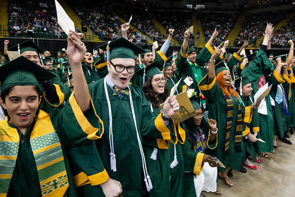
Nearly 1,500 students to graduate at Wright State’s spring commencement ceremonies
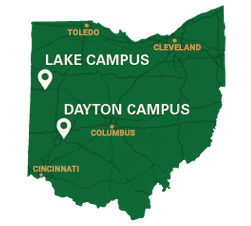
Wright State will hold its spring 2024 graduate ceremony on Friday, April 26, at 7 p.m. and its undergraduate ceremony on Saturday, April 27, at 10 a.m. in the Wright State University Nutter Center.